
In 2002, the magazine underwent a design overhaul with a new font, custom tailored for the company, larger photographs and more white space to ‘de-clutter’ the page layout, enticing the reader to linger a bit longer in the new found space.
Without sacrificing content or information, the magazine successfully streamlined the words on the page and blended them cohesively with the beautiful photography to achieve a seamlessness not easily replicated.Here is an article from Folio magazine on the specifics of the redesign in 2002, which began with the October issue of that year.
Article by Sarah Gonser for Folio Magazine, October 2002:
Nobody carves a pumpkin quite like Martha. While most of us are satisfied to scrape out a cockeyed jack-o'-lantern and call it a day, Martha doesn't rest until she's constructed a full-blown fright factory, complete with eerily glowing pumpkin tombstones (based on inscriptions found in eighteenth-century burial grounds) and haunted two-story mansions with swinging shutters and rooftop shingles. And what MS-concocted scare-fest would be complete without a thorough foray into the paranormal? Did you know, for instance, that the earliest recorded ghost appeared in ancient Greece? And that the spookiest estates can be found in St. Louis? It's all in the October issue of Martha Stewart Living. No surprise, really. When Martha preps for Halloween, she leaves no headstone unturned.
Therefore, when the doyenne of domestic design put her mind to a redesign of MSL, the centerpiece of her multimedia empire, the same no-detail-is-too-tiny mentality applied. Fonts were crafted from scratch; templates, grids, color palettes, and style sheets became an everyday obsession. The office turned into an aesthetics test kitchen where the design crew cooked up a new look for two painstaking years. "You can't put a comma in that magazine without having a committee meeting," says one MSL freelancer, "so no one was surprised that it took so long."
Redesigns are risky business, and in its 11-year history, Martha's magazine has gone under the X-Acto knife only once before, for a minor face-lift in 1996. But the newsstand had grown crowded with me-too competition. "People were always emulating us, "says Eric Pike, the executive creative director. "In a lot of ways we created a trend in magazines. No one was as clean and book-like as we were. The market was about busyness, layers of information, dingbats, and design tricks to keep people engaged." Three National Magazine Awards later (two for photography and one for design), MSL had proved a little too inspirational. To stop the blatant borrowing and defend its turf on the newsstand, the designers had to create something that couldn't be easily copied.
There were other motives as well. Between the mid 90s and 2002, the magazine's circulation grew by 40 percent, and as it collected more readers, it drew more ad pages. More ad pages meant more content, and soon the TOC was teeming with dozens of departments and sections - to the point where MSL's clean design had become cluttered. And as all Martha fans know, clutter is definitely not a good thing. "The front-of-book became really, really fat," says creative director Gael Towey. "We felt it was getting harder to navigate."
Then there was the typeface. "I knew it needed to be bigger," says Barbara de Wilde, the art director. "My sister is a librarian, and she said, 'I'm not going to read your magazine until the type is bigger.'" Plus, the words bite-sized kept coming up in focus groups. Readers were looking for quicker hits of information rather than long, flowing text, according to Margaret Roach, the editor-in-chief. "People seem to want to get to the point more quickly." The team was also looking to freshen a title that was, frankly, in jeopardy of growing a bit stale.
Finally, there was the sticky situation of evolving the magazine by creating an identity that was less reliant on Martha herself.
With the October 2002 issue, Martha Stewart Living unveiled a revitalized magazine. Touting a new specially commissioned font, larger photographs, an overhauled FOB, and a multitude of charts, grafts, and lists, the redesign also introduced new and tweaked columns and sections.The results of the two-year effort are subtle, says Towey. The design is more methodical. In fact, one MSL freelancer says the entire process was an exercise in meticulousness: "They pinned mockups all over the wall, and there were days when Eric, Gael, and Martha would just stand and stare at them for hours."
To illustrate the thinking behind the redesign (and to shed some light on why it took so long), the MSL team took FOLIO on a backstage tour of the revamped magazine.
PHOTOGRAPHY
The mass of how-to instructions in MSL can make even the most daring domestic goddess feel a little overwhelmed. "For 11 years we've been looking for that perfect place where our readers aren't given too much information - which makes it look too difficult - yet there's enough information so that they can successfully complete the project," says Towey. "[The redesign] tried to make everything simpler, to calm it down."
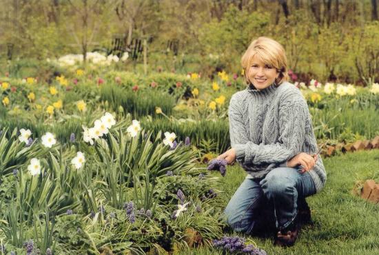
 To clean out the clutter, the team played with photography. "It's the same, but cleaner," says Towey. "We're putting fewer photographs on the page, and they're larger and easier to see. We didn't want the typography to overwhelm the photography - we wanted the photography to be the hero."
The redesigned pages have also been "aired out maybe 10 percent," says Pike. "There's more white space," adds Roach. "We peeled back a little bit of the 'too much' to make the essence come out."
MODERNIZATION
The newsstand has its fair share of fading starlets, but the makeover of MSL was intended to keep the wrinkles at bay. "As your readership ages, you can make the mistake of becoming your mom's magazine," says Towey. You have to keep attracting younger readers, she says, "so there was a drive to be more modern." The index of the mag is now on the spine, and various concepts have been updated. "Historically, this page was a moody, inspirational shot with emotional text about the seasons," she says. "Now it has been redesigned as a sort of still-life photograph, accompanied by several season-related, historical, or novel facts. We will create this still-life icon month after month. I think that it's award-winning."
"The amount of white space is like a drum roll," says de Wilde. "It leads you up to an event, stages everything else on the page. If you use white space when you design, you can add drama." The redesign also shakes up the position of objects on the grid. "By becoming asymmetrical, we've added a modern element. Before, the balance was very centered," adds de Wilde.
THE FONTS
In late 2000, de Wilde began talks with font designer Jonathan Hoefler, of New York-based Hoefler Type Foundry. "We needed a font you could use - small, large, and throughout the front of the book," she says. Also, although MSL doesn't use boldface type - because "we don't shout," explains de Wilde - the designers do favor italics. "The italics looks like a voice, or a quote." She decided that two fonts would be needed: one front-of-book workhorse, and an elegant, classical-yet-modern font for the feature well.
For the well, the Living team settled on a light serif font inspired by old, hand-drawn maps. For the front of the book, a slab serif called Archer became the font of choice. It took four months for the basics of Archer to be designed so that de Wilde could begin flowing front-of-book text and testing its abilities. Archer debuted, complete, in the October issue. The well font, Surveyor, however, is still several months away from completion and won't appear until the February issue.
"When you have a magazine that prints at the numbers we do, they don't want you experimenting," says de Wilde of the still incomplete Surveyor.
The new fonts will not only improve readability, adds Pike, but they'll also protect the new look. "It's hard to emulate you when you have a proprietary typeface. The innate quirkiness of the particular font has a really specific character. People can't copy it to the same degree."
READABILITY
The savory photography in MSL has a way of creating a craving for everything from miso soup to roast beef, but readers looking to put the recipes to the test were grumbling that the directions were difficult to read. "You should be able to put the magazine on the counter, stand up, and make whatever you're making," says Towey. "We needed better readability." The new font helped, but from the FOB to the feature well, the number of elements on a page needed to be reduced.
Then, to satisfy reader appetite for bite-sized info, the new templates were fitted with bullets and charts. "People have changed their reading habits," says Roach. "It's good to step back and see that we don't always need a 1,000-word story. It'll never come down to just 10 words on the page. But sometimes you just don't need poetry. You need information."
COVERS
The cover logo is the same, and even the photography is similar. But the Archer typeface is used to introduce simple, clear blips of information on the upper-left side of the cover, Pike explains. "A lot of magazines out there put shadows, outlines, and all this stuff all over their typefaces - that just adds to the busyness of the newsstand," he says. "They all think that's what America wants. We would rather have clearer, more arresting photography that hopefully gives you a sense of peace.
"There's a lot more competition on the newsstand, adds Towey. "You have to make a very iconographic statement that people will see from far away. It must clearly say, 'This is a new issue - buy me!'"So what does a renovation like this cost? The folks are MSL declined to show us the bill, but they say the ROI is in the eye of the reader and advertiser. "Advertisers are very design-driven," says Lauren Stanich, president of publishing. "And the fact that it's a beautiful magazine helps showcase their ads. From a business point of view, if it's easier for the reader to navigate the magazine, [new business] and renewal numbers will increase.

"Hoping for an objective take on the MSL team's efforts, we sent the October issue to Robert Valentine, a design consultant. Right from the start, his impressions bore out the team's goals. "It seems cleaner," says Valentine. "They created a magazine for everyone now. The front of the book is simpler. The projects are simpler. A lot of people don't pay attention to individual departments and put all their attention into the feature well. But that's what sets Martha apart - she's great at paying close attention to the details."
THE PERILS OF NAMESAKE BRANDING
Before Martha Stewart Living Omnimedia began trading on the New York Stock Exchange in 1999, the company warned investors that the "business would be adversely affected if Martha Stewart's public image or reputation were to be tarnished." In its prospectus, MSLO said it would increasingly focus on spreading content-creation across a team of experts.In the three years since then, Martha Stewart has appeared on the cover just once - in January 2001, a 10-year anniversary issue. So one important mission of the redesign was to allow for key editors to be introduced in future issues. First up was Susan Spungen, the food editor, with Easy Entertaining. "We're introducing everybody," says creative director Gael Towey.
Still, months of negative press about Martha Stewart's alleged involvement in the ImClone stock scandal have critics speculating about irreversible damage to the brand. While MSLO stock dipped to an all-time low - hovering in October around $6, down from a 1999 high of $49.50 - year-to-date ad pages grew 2.5 percent and ad spending increased 8.8 percent. In other words, the scandal has produced mixed, somewhat indeterminate results. "There hasn't been the slippage of readership people expected," says George Fertitta, president and CEO of New York ad agency Margeotes/Fertitta + Partners. "But there has been some advertising withdrawal.
Still, months of negative press about Martha Stewart's alleged involvement in the ImClone stock scandal have critics speculating about irreversible damage to the brand. While MSLO stock dipped to an all-time low - hovering in October around $6, down from a 1999 high of $49.50 - year-to-date ad pages grew 2.5 percent and ad spending increased 8.8 percent. In other words, the scandal has produced mixed, somewhat indeterminate results. "There hasn't been the slippage of readership people expected," says George Fertitta, president and CEO of New York ad agency Margeotes/Fertitta + Partners. "But there has been some advertising withdrawal.
Ultimately, just as we like to build people up and then tear them down, I believe we also forgive." Fertitta speculates that, given the time to heal, the MSLO business prognosis could be quite positive. "It's a powerful brand," he says. "But so much depends on how this dilemma is handled."
Branding expert Larry McNaughton, president and COO of CoreBrand, has his doubts. "Instead of standing for something that's going to last a lifetime, like Disney, or Michael Dell, or Steve Jobs, Martha Stewart stood for a lifestyle," says McNaughton. "The issue here is that a brand based entirely on personality, on celebrity, is hugely fragile. It is incredibly difficult, if not impossible, to translate that into something deeper, more stable, and relevant without losing the original appeal of the brand." Given the current course of events, he says MSLO may have no other choice than to excise Stewart from the brand. "Martha Stewart is approaching the backside of the bell curve of her celebrity," says McNaughton. "If they were to start MSL today, I don't think anyone would buy it."
THE COMPETITIVE SET
Although just more than a decade old, MSL is often considered the founding grandmother of the genre. But now the newsstand is crowded with competitors. In the last year alone, new titles such as Chic Simple, Budget Living, Cachet, LivingRoom, and ReadyMade began vying for a piece of the nester market. The MSL staff acknowledges that the heat's been turned up but says the redesign will go a long way toward making their glossy pop on the newsstand. "There's a fundamental difference between us and everyone else," says Roach.
Although just more than a decade old, MSL is often considered the founding grandmother of the genre. But now the newsstand is crowded with competitors. In the last year alone, new titles such as Chic Simple, Budget Living, Cachet, LivingRoom, and ReadyMade began vying for a piece of the nester market. The MSL staff acknowledges that the heat's been turned up but says the redesign will go a long way toward making their glossy pop on the newsstand. "There's a fundamental difference between us and everyone else," says Roach.
"We honor doing everything from scratch. If you look at our masthead, as compared to, say, Real Simple, I bet they have two or three people in their food department. We have 15 people in the kitchen and a bunch more contributing editors. It's harder to do it the way we do, but it's who we are. That's our trademark, and that's how we differentiate."
MARTHA OPENS UP
Q: What prompted the redesign?
A: The magazine had to evolve. It had to grow in order to deal with the times, people's changingattitudes and evolving lifestyles. Of course, the magazine had subtly evolved over the years, but this redesign was more than subtle because it involved a change of fonts, headlines, the index printed on spine, clearer photography - all of which helped to create a clearer, more helpful, easily accessible experience for the reader.
Q: What about the old design wasn't working?
A: It wasn't that it wasn't working, exactly. Other magazines had started looking like our magazine. Others began using the same typeface, logos, and visual style. And that just wasn't appropriate. We are more trendsetters than followers.Sometimes [Living] was a little difficult to read. For instance, when we'd run type over photography. That doesn't work for the homemaker. She wants clarity. She wants information that's easy to read, instructions that are simple to follow, and beautiful photography. The chaotic magazines of the mid 90s - the avant-garde, hard to read designs found in tech magazines - don't work for the homemaker.
Q: Do you worry about the competition?
A: No. Why should I? I mean, other magazines started to look like our magazine, not the other way around. Right now there's a whole spate of magazines with "living" in the title. The typefaces look peculiarly similar to ours.
Q: Did you ever worry about the length of time the project was taking, and the cost?
A: No, not at all.
Q: Will the average reader and advertiser recognize the improvements?
A: Oh, absolutely. We already received lots of letters from readers saying things like, "Thank you for printing the index on the spine." It might appear subtle, but they notice all these little changes. They're very detail-oriented.
Q: Some have inferred that the redesign was a way for the magazine to reduce its dependence on your name, your face. Was that the case?
A: I don't think the redesign removes my importance from the magazine at all. It has nothing to do with that. What it does is make the magazine more visual and appealing to the reader. It has absolutely nothing to do with that.
No comments:
Post a Comment